

Mr.
Young’s
 Class
Class
This way to our
Web Page
Do you really know when you used which graph with the data you have?
This website will help you
get a better understanding of the different types of graphs and help you to
know when to use which graph determining the type of data you have.
There are many types of graphs, the most common ones
include:
·
Bar
·
Line
·
Scatter Plot
·
Pie
·
Histogram
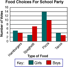
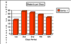
Bar Graph
Bar
graphs are a very good way to show results that are one time, that aren't
continuous - especially data such as surveys and inventories. Below we have placed a graph for you to look
at. Notice that in this graph each
column is labeled. These graphs are
helpful when needing to know which Item is favored or least favored.
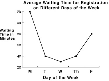
Line Graph
Line
graphs are used to represent data or sets of data that were gathered over a
period of time. The data is then
plotted on a graph with standard intervals of time. Then you have a line connecting all of the points in the correct
order. People most commonly use this
type of graph to show how a business is doing or to show growth or decay. After making a line graph you will be able
to notice
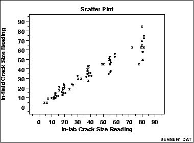
Scatter Plot
A scatter plot is a graph consisting of a collection of points
meant to show the relationship between one variable plotted on the vertical or
Y axis and another variable given on the horizontal or X axis.
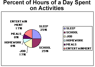
Pie Graph
A
pie graph is also known as a circle graph people use these type of graphs are
good for getting a good idea of percents. These graphs are particularly good illustrations when considering how
many parts of a whole are in question.
The pie chart is divided very
much as a baker’s pie would be into slices that represent the proportional
amounts of the whole. It is also
helpful to shade the different sections different colors, to distinguish the
size of the section.
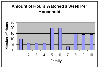
Histogram
Histograms
look very similar to bar graphs this is why many people mix them up. The main difference between the two would
be, that bar graphs are not made up with both lines being numbers. Instead it uses either objects or people.
Here is some data that we took and put
the data in our calculator to make a histogram.
DATA:
|
Number |
Data |
|
1 |
10 |
|
2 |
6 |
|
3 |
6 |
|
4 |
6 |
|
5 |
20 |
|
6 |
20 |
|
7 |
3 |
|
8 |
15 |
|
9 |
14 |
|
10 |
14 |
HISTORGRAM:
This website was made by Brandy Gulley and Haley
Weaver. The purpose of this website was
to give everyone one who reads it a better understanding of graphs. This website was made for an assignment in
our Algebra II class. If you would like
any other questions answered then feel free to contact our teacher Mr. Young at
dyoung@fayar.net.
Other Related
Websites:
http://people.freenet.de/Emden-Weinert/graphs.html
http://www.whidbey.net/ohms/linegraphs.html
http://www.shodor.org/interactivate/lessons/sm3.html
http://cstl.syr.edu/fipse/TabBar/Coverpg.htm
http://www.shodor.org/interactivate/discussions/sd4.html
http://www.ncsu.edu/labwrite/res/gt/gt-bar-home.html
http://mainland.cctt.org/mathsummer/JosephBond/bargraphs/bargraphs_std.htm
http://www.twingroves.district96.k12.il.us/ScienceInternet/ChartsGraphs.html
http://user1.stritch.edu/~dienerd/perpro/graphs.html
http://www.ncsu.edu/labwrite/res/gh/gh-bargraph.html